
Role: Design, Art Direction
Client: DoorDash
DoorDash for Merchants
Made at DoorDash (Superette)
Global Head of Design: Adriel Teles
Creative Direction (Design): Chris Ballard
Art Direction/Design: Chris Ruppelt, Eva Edgren
Copy: Jen Brown
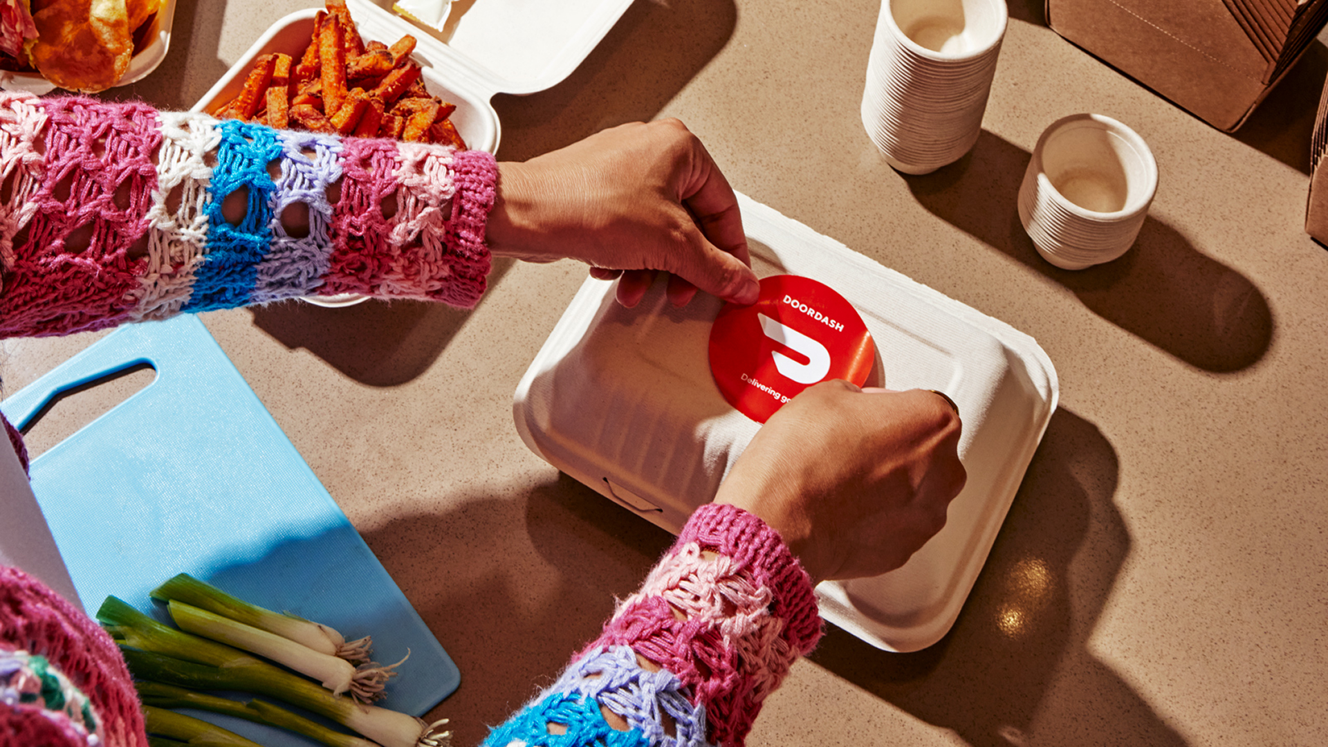
Photography: Laura Murray
The goal was to develop a visual identity that could speak to merchants on the DoorDash platform. We aim to give merchants (large or small) everything they need to grow and operate their business. We needed to create a flexible design system that could meet a myriad of needs driving brand consistency and speaking authentically to merchants.
Visual Elements
Every merchant has a story. Our design approach is all about offering a window into that story that grounds us in the ideas of growth and expansion. We explored this graphically. Shapes are used as framing devices and graphic elements to create a flexible visual system across layouts and surfaces.

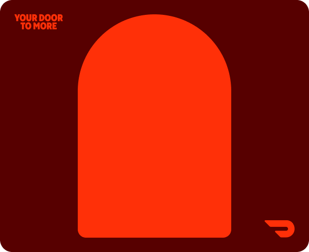
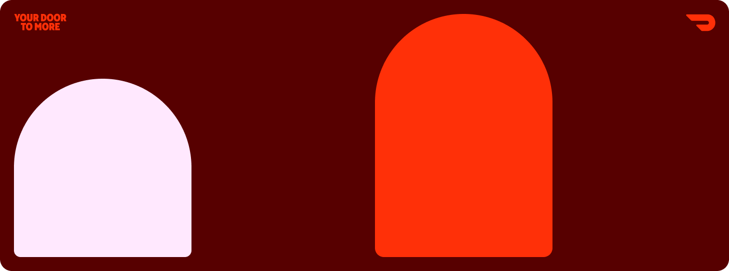
Archways
We use archways in large brand moments and also in combination with the other shapes.

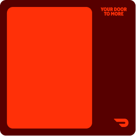
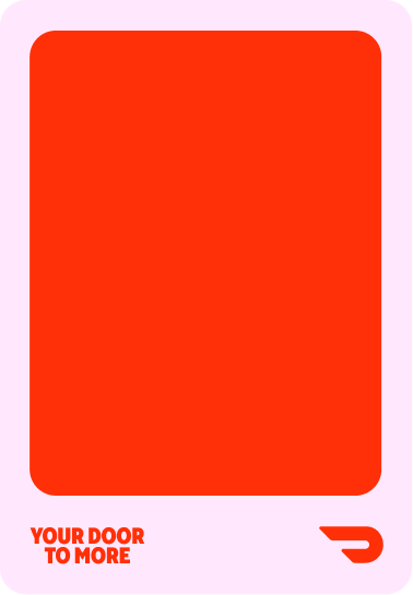
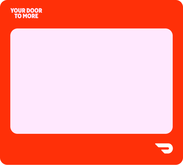
Rounded Rectangles
We use these in more informational moments, or areas where space is more limited.

Circles
Circles can also be used sparingly to highlight an idea or in spatial design.
Flexible Layouts
Here are some examples of layouts and shapes across multiple sizes. Margins always surround the designs to reinforce the graphic idea of a window or frame. Archways and rectangles were able to expand vertically to suit various sizes.


Color
Motor Oil and Bouquet complement Delivery Red and support the Merchant brand’s overall identity. We created a dynamic palette that could capture the vibrance of the brand and build on the recognition of DoorDash Delivery Red.
DoorDash Delivery Red
Delivery Red is a primary brand differentiator and pillar of brand recognition.
Motor Oil
Motor Oil provides a rich darker color to the palette. It appears in background colors and typography.
Bouquet
Bouquet allows for lighter moments and more vibrant instances as a background color and in typography.
Photography
We partnered with photographer Laura Murray to capture the diversity of merchants in a stylized but natural way representing businesses and merchants of all shapes and sizes. We establish a sense of realism, while capturing their individual, nuanced personalities, as well as an overarching sense of optimism.
In use
The design system flexed across a variety of surfaces — hard working emails and digital banners, social, event activations, and templated sales collateral. Some examples are included below to show how all the pieces of the system work together across surfaces.