Role: Design, Art Direction
Client: Nuvve
Levo Identity
Made at Vitro
Creative Lead (Art) Mike Brower, Oliver Duncan
Creative Lead (Copy) Robin Bartolini
Designer & Art Director Chris Ruppelt
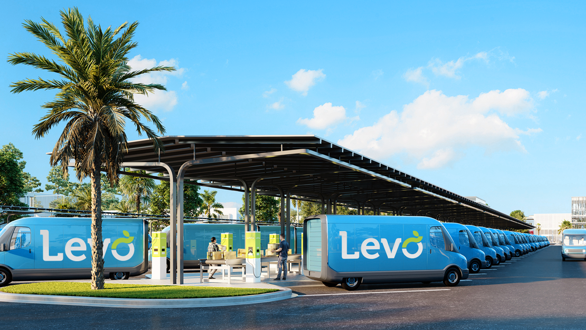
A joint venture between Nuvve and Stonepeak needed a name, logo, and website. The new company, Levo, provides smart charging software for electric vehicles, leasing options for fleets, and charging hubs that harness renewables. Their goal is to accelerate the electrification of vehicles and transform the energy grid.
Logo Exploration
EV fleets and private vehicles can be used like batteries, selling energy back into the grid when demand increases and offsetting higher carbon emitting energy that would be consumed otherwise. We explored design territories with this in mind.
Design Territories
01 Energy Exchange
At the core of our offering is a proprietary, bidirectional V2G platform that makes EVs more affordable.
02 Comprehensive Hub
We’re a complete solution. We centralize charging infrastructure and smart charging solutions into a comprehensive hub.
03 Future Sustainability
We’re forward-thinking and sustainably minded, pioneering solutions that bridge the gap between transportation and energy.
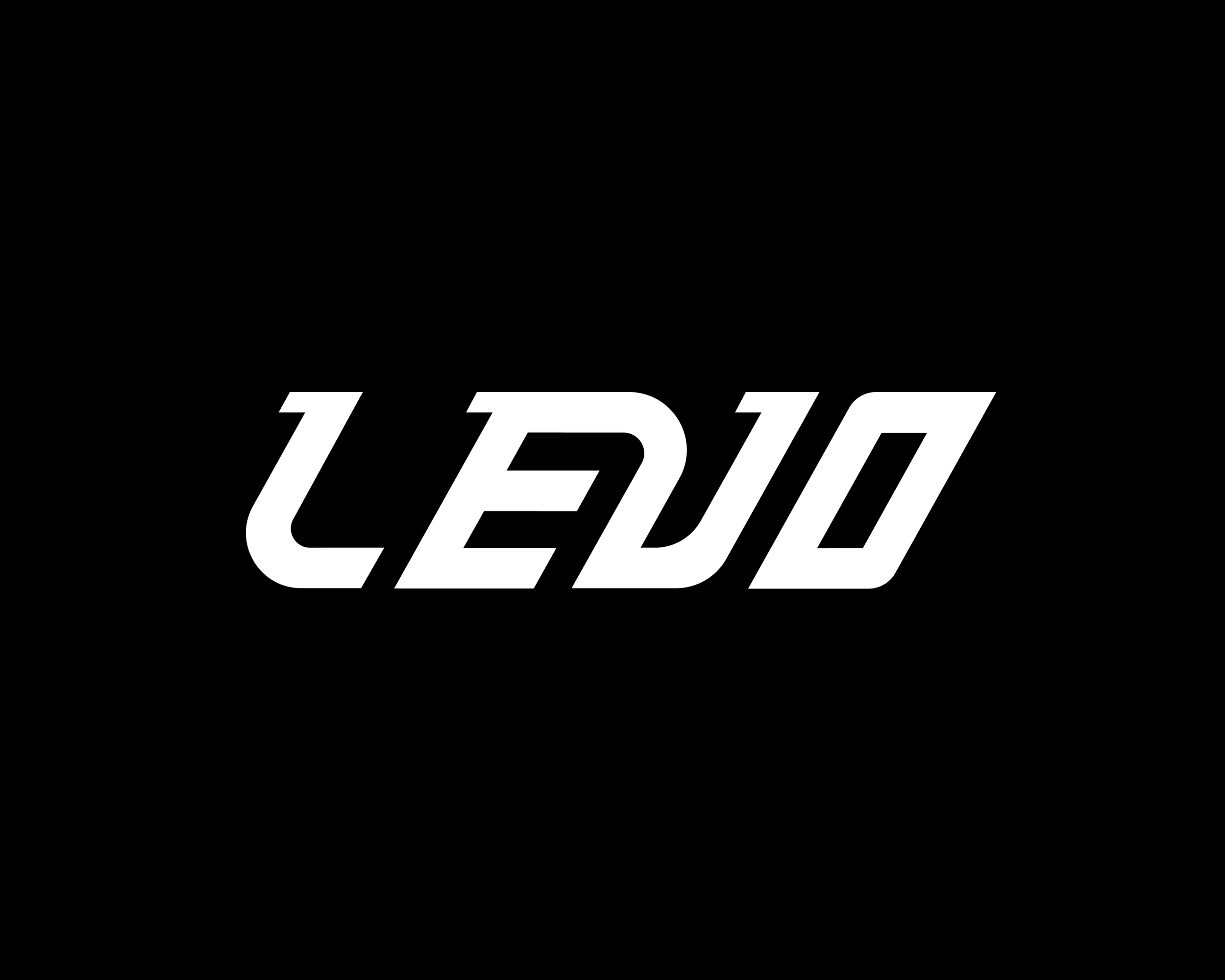
Exploration 01
A zippy wordmark that speaks to the energy of electrification and feels confident in the vehicle space.
Design Territory
Energy Exchange
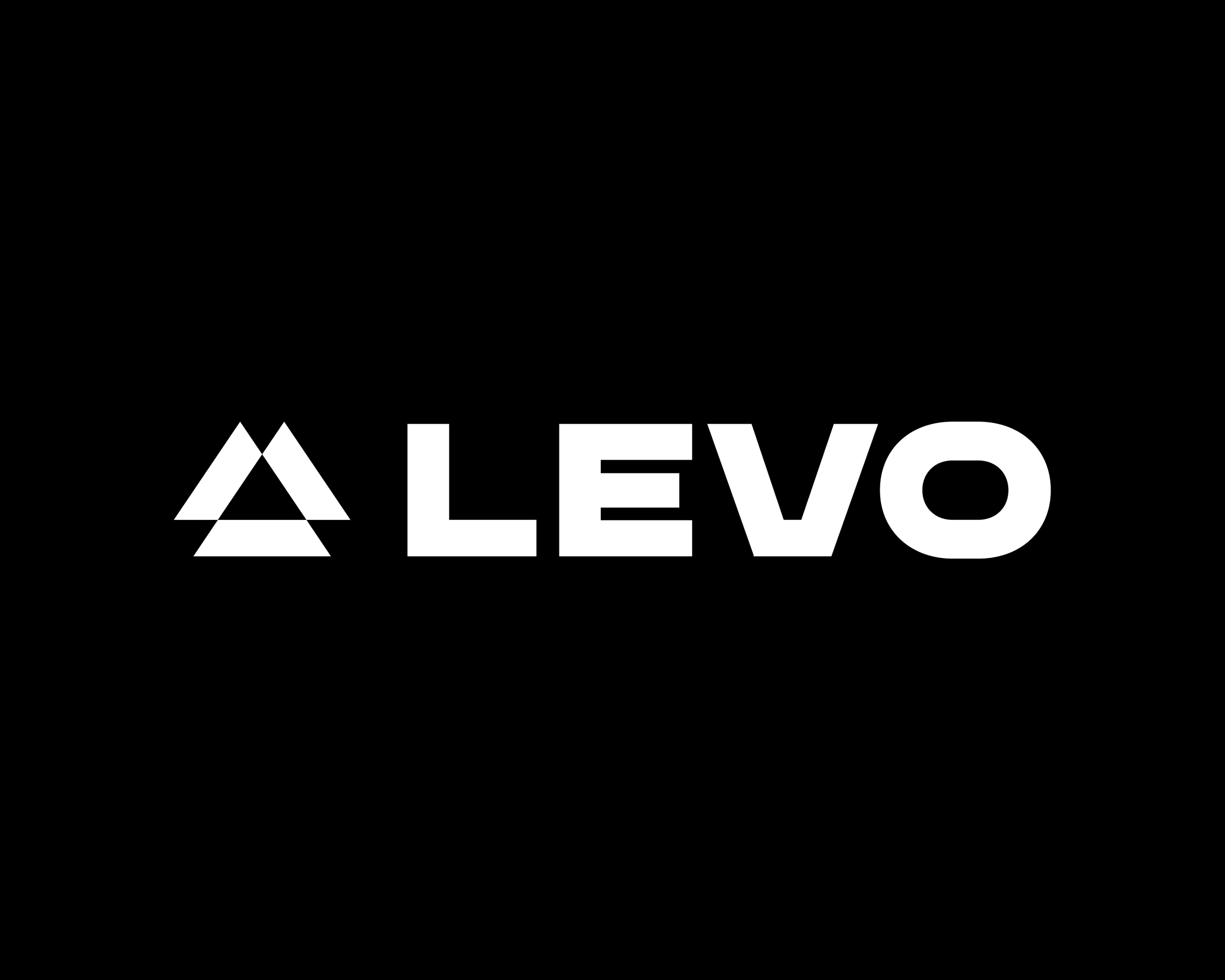
Exploration 02
Three facets represent the brand offerings: EV Leasing, Software and Hub Locations. The triangular “delta” shape connotes change and transformation.
Design Territory
Comprehensive Hub
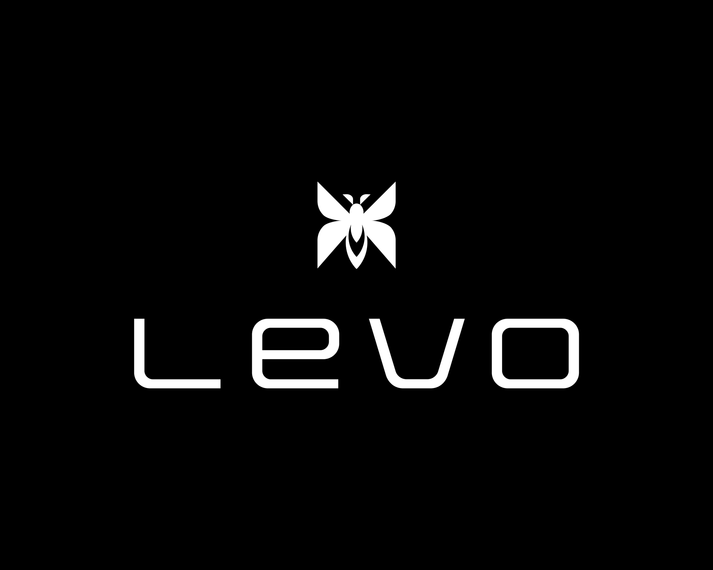
Exploration 03
A light modern wordmark paired with a monarch butterfly icon. A clear story of transformation.
Design Territory
Future Sustainability
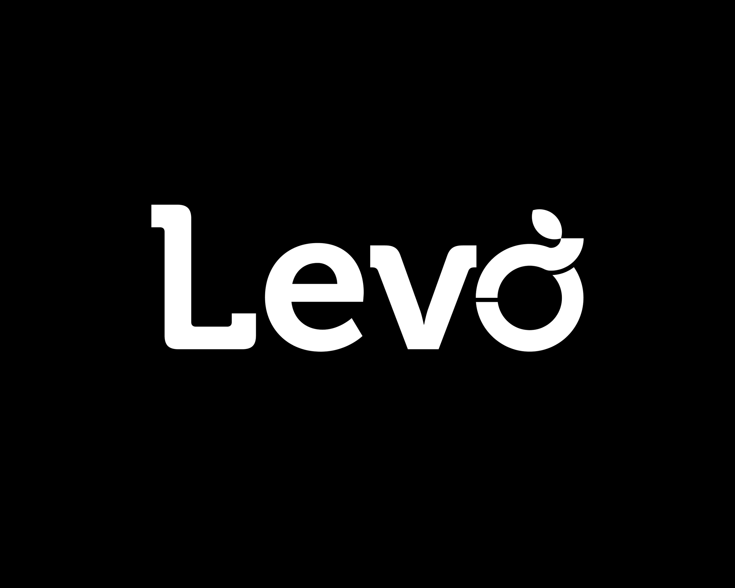
Exploration 04
A friendly wordmark. The letter “o” is segmented with a tail sweeping upward topped by a leaf as a nod to sustainability and growth.
Design Territory
Future Sustainability
Visual Identity
The final logo was an approachable wordmark and icon. Additionally we explored colors anchored in the partner brands and typography that could feel own-able in the wordmark, but flexible enough to work across surfaces.
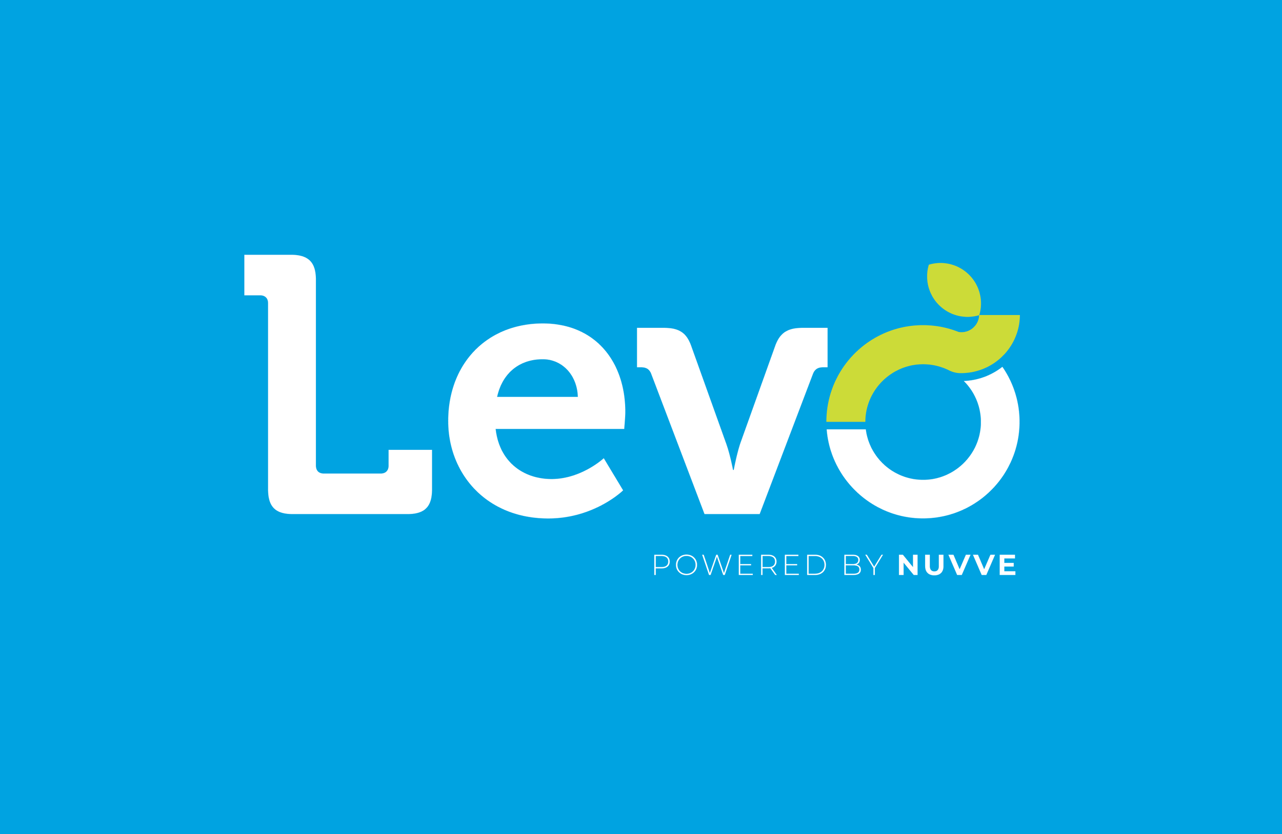
Primary Wordmark
Used in most instances.
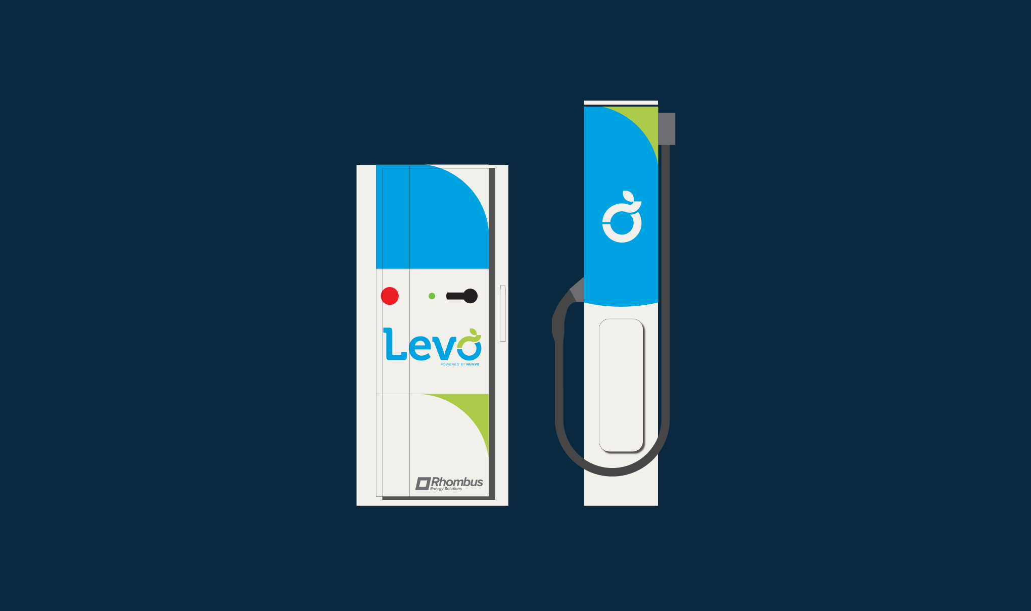
Icon
Limited shorthand use.
Color
The color palette was informed by the need to balance existing brand equity and a push for something new. We paired Nuvve’s Grass Green with a vibrant blue and deep navy for darker backgrounds.
Sky Blue
A vibrant blue was the primary Levo brand color.
Grass Green
A nod to existing equity and Nuvve’s software.
Open Water
A deep background color that pairs with Sky Blue.
Typography
Levo has two brand typefaces. Museo 700 is the slab serif used in the wordmark and as a display typeface for headlines. Montserrat is used for subheads and body copy.
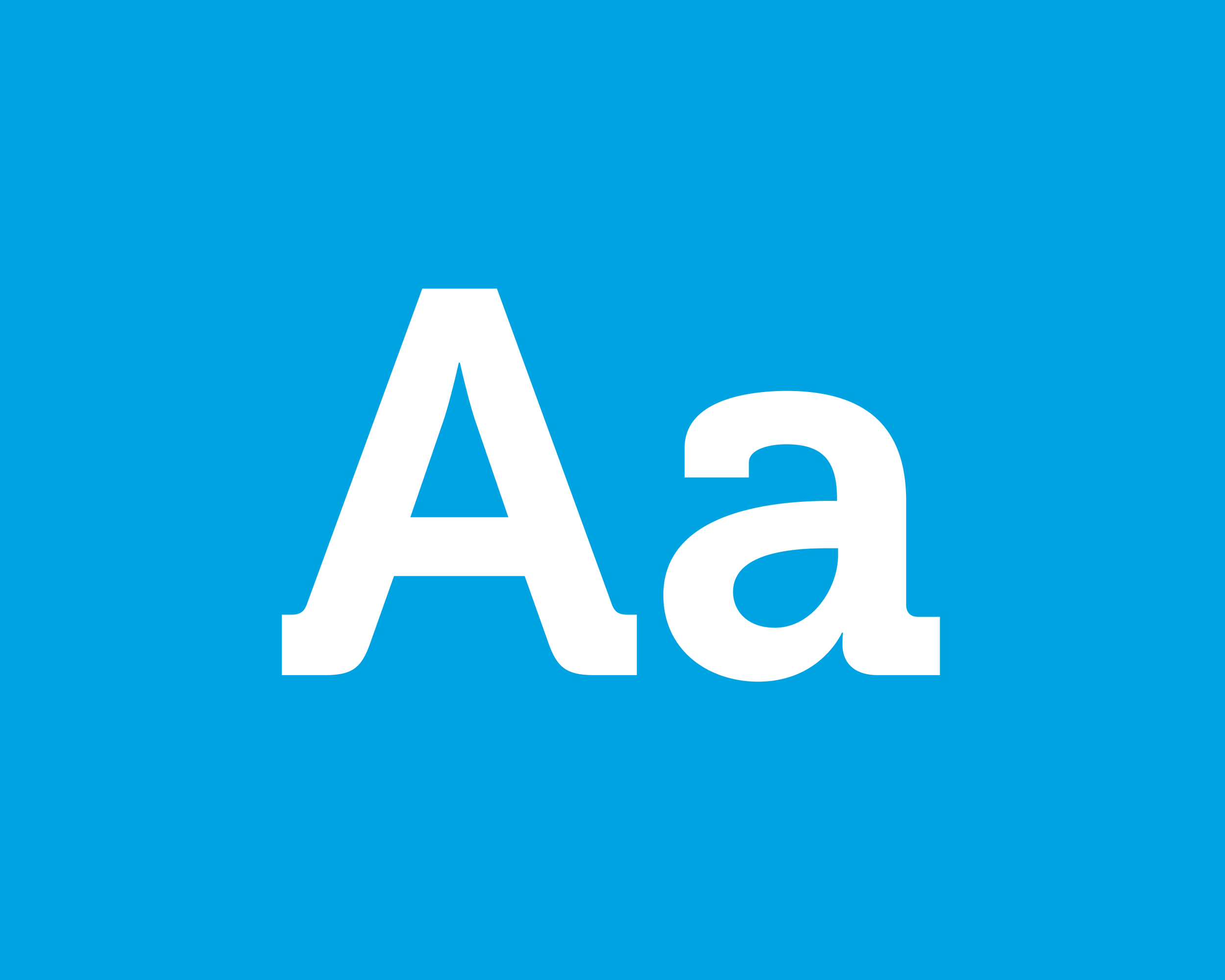
Museo 700
Primary used as display for headlines.
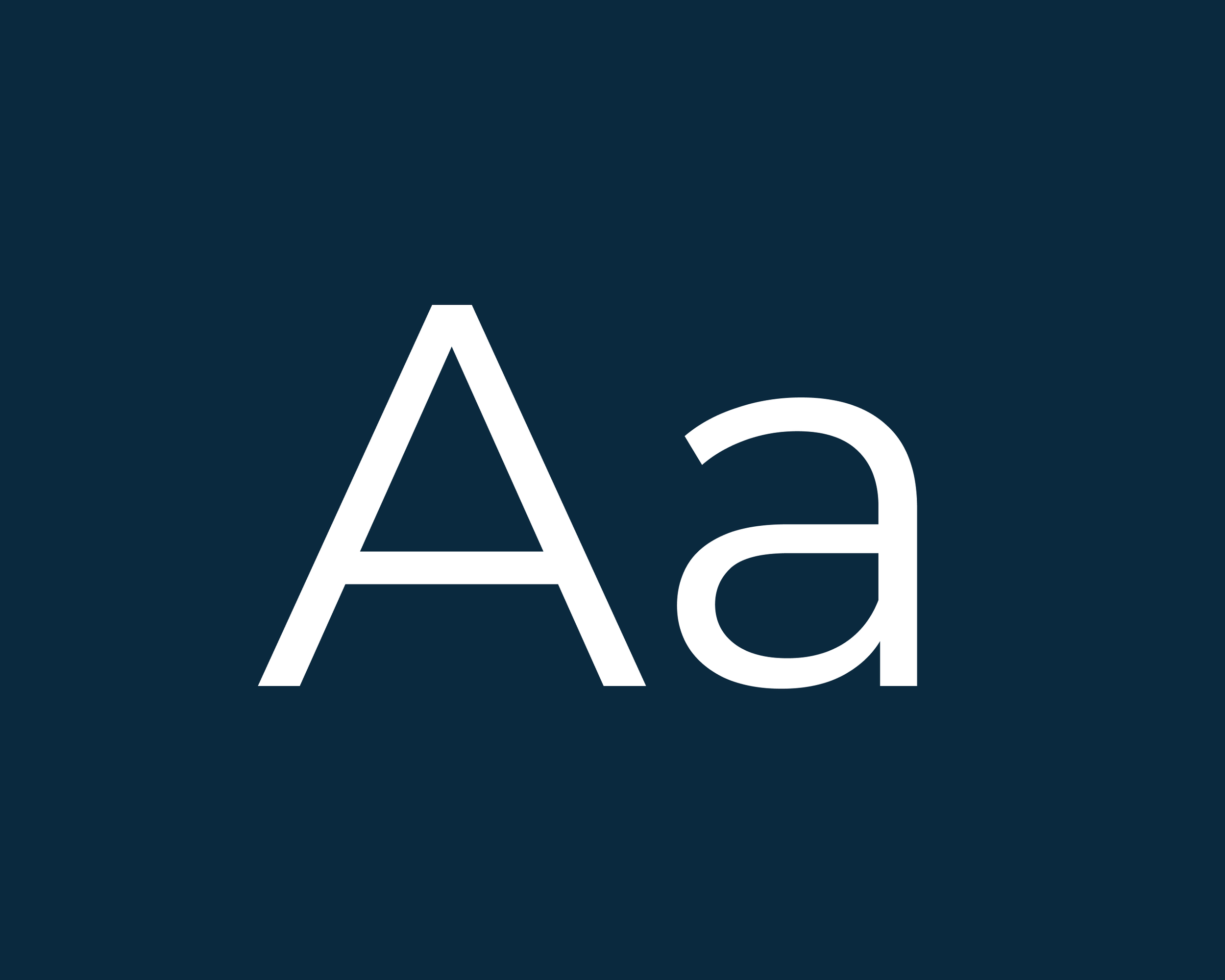
Montserrat
Secondary for subheads and body copy.
Style Guide
We summarized our manifesto, tone of voice, and visual identity into a useful guide that the client and partners could use to ensure creative consistency.
In Use
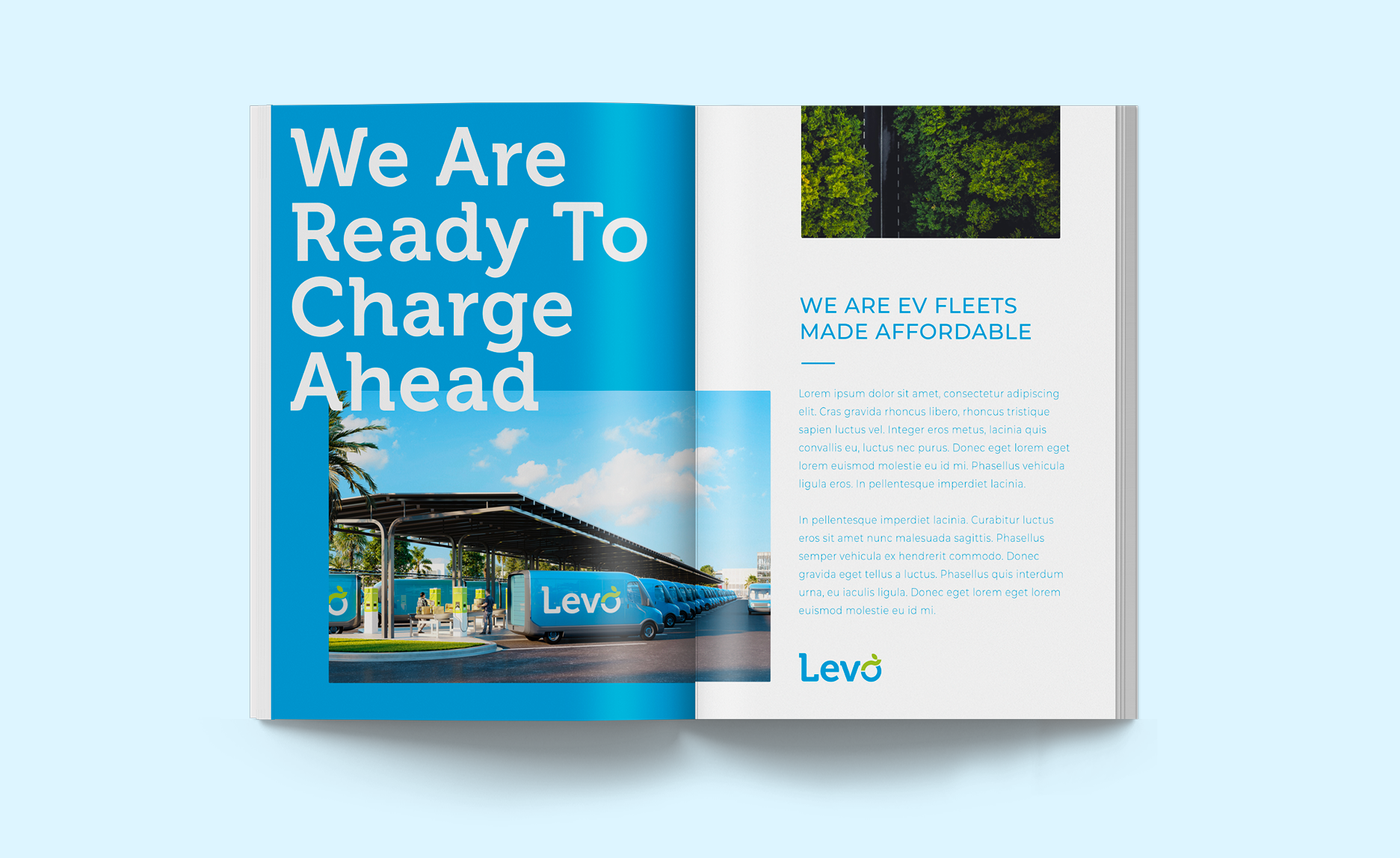
We provided a range of visuals to test the identity. The most integral deliverable was the website which was designed and developed in house at Vitro.